ResiLend is a mortgage broking business helping first-home buyers, investors, and clients refinancing. The brand focuses on clarity, trust, and professional service in the finance sector.
ResiLend had a single horizontal logo. Our goal was to expand it into a full logo suite with consistent structure and flexibility for different formats and uses.
We began by reviewing the original horizontal logo to assess proportions, spacing, and colour. The logo had a strong foundation but limited flexibility. We refined the layout and built out new formats to improve usability across print, digital, and signage.
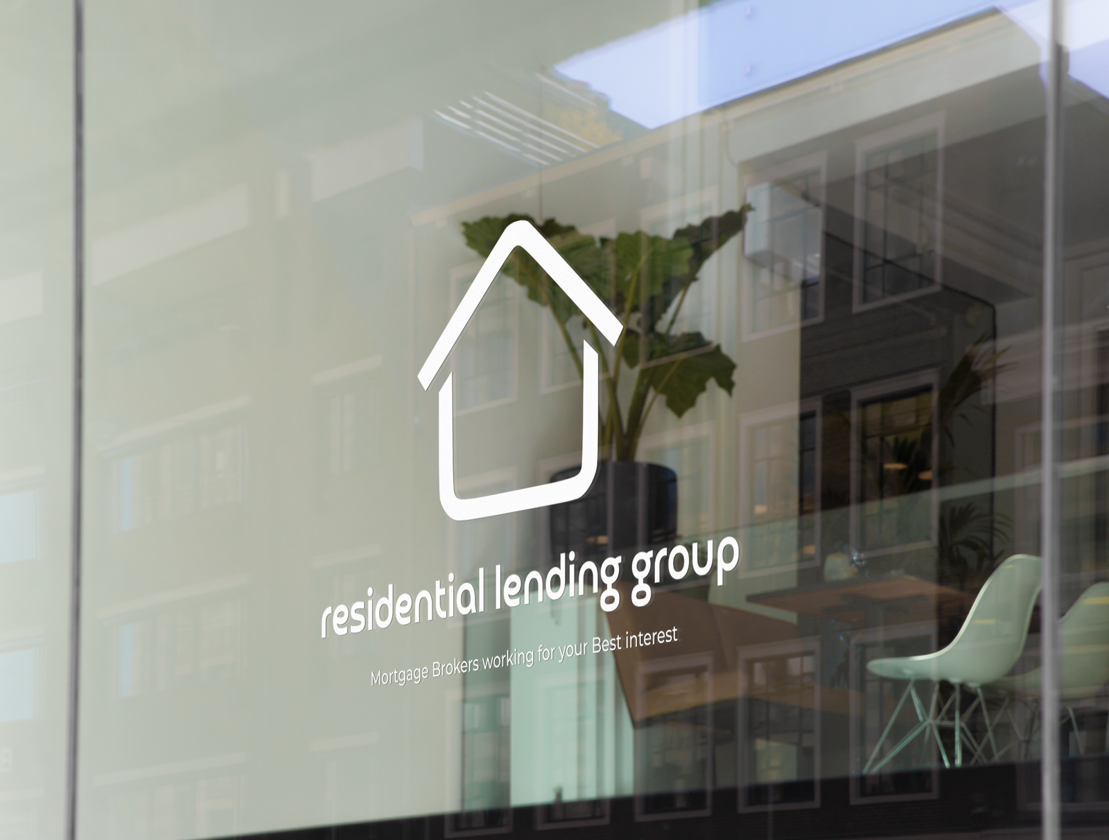
The updated logo suite included a vertical version for stacked layouts, a simplified logo mark for smaller applications, and versions that incorporate the tagline for larger placements.
Horizontal logo refinement
Vertical logo version
Logo mark for compact use
Tagline lockup versions for wider formats
Optimised files for web and print
What we delivered:
Refined Primary Logo
Vertical and Logo Mark Versions
Tagline Lockups
Full Logo Suite
Web and Print File Formats
A complete logo suite creates consistency across every platform. Expanding ResiLend’s original logo into multiple variations gives the brand flexibility while maintaining a cohesive visual identity.